How Do I Make My Website Mobile Friendly for Australian Users?
Discover the essential steps to making your website mobile friendly for Australian users in 2026, from responsive design and Core Web Vitals optimisation to page speed improvements and mobile navigation best practices.
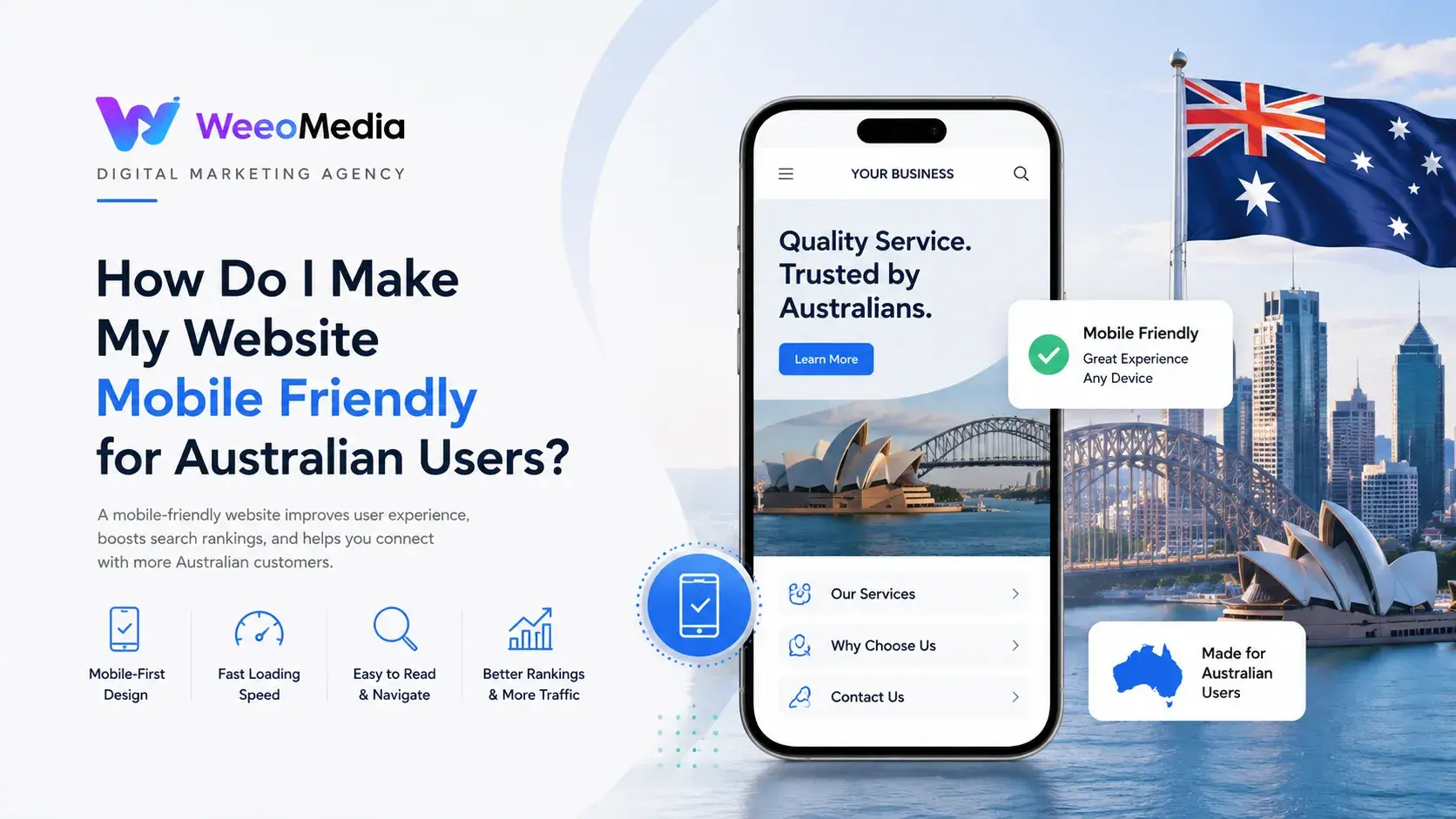
In 2026, having a mobile friendly website is not a bonus feature or an optional upgrade. It is the absolute baseline requirement for any business that wants to be found online, retain visitors, and convert them into customers. Australia has one of the highest smartphone penetration rates in the world, with the overwhelming majority of internet users now accessing websites primarily through their mobile devices. If your website delivers a poor experience on a phone or tablet, you are losing visitors, rankings, and revenue every single day.
Google switched to mobile-first indexing several years ago, which means it now uses the mobile version of your website as the primary basis for determining your search rankings. A website that looks and performs well on desktop but delivers a frustrating experience on mobile will be ranked accordingly, pushing it further down search results in favour of competitors whose mobile experience is stronger. For Australian businesses competing in an increasingly crowded digital landscape in 2026, mobile friendly website design in Australia is directly tied to your SEO performance, your user experience, and ultimately your bottom line.
This guide walks you through everything you need to know about making your website genuinely mobile friendly for Australian users, from technical foundations and design principles to performance optimisation and testing tools.
Why Mobile Friendliness Matters More Than Ever in 2026
The shift to mobile-first internet usage in Australia has been consistent and accelerating. Australians spend more time on their smartphones than on any other device, using them to search for products and services, compare options, read reviews, and complete purchases. In sectors like travel, hospitality, retail, and local services, mobile search accounts for the vast majority of all web traffic.
Beyond user behaviour, Google's algorithms in 2026 place enormous weight on mobile performance as a ranking factor. Core Web Vitals, which measure real-world user experience metrics including loading speed, interactivity, and visual stability, are now firmly embedded in Google's ranking criteria. Websites that fail these metrics on mobile consistently rank below those that pass them, regardless of how strong their content or backlink profiles may be.
For Australian businesses targeting local customers, the stakes are even higher. Local searches, particularly "near me" queries, are almost exclusively performed on mobile devices. If your website is not mobile optimised, you are effectively invisible to a large portion of your local audience at the exact moment they are ready to engage or purchase.
Mobile SEO in Australia in 2026 is not just about fitting your desktop website onto a smaller screen. It requires a fundamentally mobile-centric approach to design, performance, content, and user experience that treats mobile as the primary platform, not an afterthought.
Step One, Understand What Mobile Friendly Actually Means
Many business owners assume that because their website "looks okay" on their own phone, it is mobile friendly. This is rarely accurate. True mobile friendliness encompasses several distinct dimensions that all need to work together.
Responsive design means your website layout automatically adapts to fit any screen size, from a small smartphone to a large tablet to a desktop monitor. The content reflows, images resize, and navigation adjusts without requiring the user to zoom, scroll horizontally, or struggle to tap small buttons.
Touch optimisation means all interactive elements, including buttons, links, form fields, and menus, are sized and spaced appropriately for finger-based interaction rather than mouse clicks. Buttons that are too small or too close together create frustrating errors and push users to abandon your site.
Readable text without zooming means body text is large enough to read comfortably on a small screen without the user needing to pinch and zoom. Google recommends a minimum font size of 16 pixels for body text on mobile.
Fast loading speed means your website loads quickly on mobile connections, including 4G and regional connections that may not always have access to high-speed NBN or 5G. A page that loads in two seconds on a fast home WiFi connection may take six or more seconds on a standard mobile connection, which is enough to cause the majority of visitors to abandon the page.
No intrusive interstitials means avoiding pop-ups or overlays that cover the main content on mobile, particularly those that are difficult to close on a small screen. Google penalises websites that use intrusive interstitials that block content from mobile users.
Step Two, Implement a Responsive Web Design
Responsive web design is the industry standard approach to mobile friendly web development in Australia and has been for a number of years. In 2026, there is no justification for any new website to be built without a fully responsive framework.
A responsive website uses CSS media queries to detect the screen size of the device accessing the page and apply different layout rules accordingly. This means a single set of website files serves all devices correctly, without the need for separate mobile and desktop versions of your site.
If your website was built on a modern content management system like WordPress, Shopify, Squarespace, or Wix, it is likely already using a responsive theme or template. However, responsiveness is not guaranteed simply because you are using a modern platform. Many themes and customisations introduce non-responsive elements that break the mobile experience in subtle ways that are not immediately obvious from a quick glance on your own device.
A thorough responsive design audit should check that all layout columns stack correctly on narrow screens, all images scale proportionally without overflowing their containers, navigation menus convert to a mobile-friendly format such as a hamburger menu, all text remains readable without horizontal scrolling, and all buttons and form elements are appropriately sized for touch interaction.
For businesses with older websites that were built before responsive design was standard, a full rebuild on a modern responsive framework is often the most practical and cost-effective path to genuine mobile friendliness.
Step Three, Improve Your Website's Loading Speed on Mobile
Page speed is one of the most critical factors in both mobile user experience and Google rankings. Australian users in 2026 have high expectations for how quickly websites should load, and research consistently shows that even a one-second delay in mobile load time can result in a significant drop in conversion rate.
Website speed optimisation for Australian users on mobile involves addressing several technical factors simultaneously.
Image compression and modern formats: Images are typically the largest contributors to page weight and slow load times. Every image on your website should be compressed to the smallest file size that maintains acceptable visual quality. In 2026, using next-generation image formats like WebP and AVIF is standard practice. These formats deliver significantly smaller file sizes than traditional JPEG and PNG at equivalent or better visual quality. You should also implement lazy loading, which means images below the fold only load when the user scrolls down to them rather than all at once on page load.
Browser caching: Caching instructs a user's browser to store copies of static files like images, CSS, and JavaScript locally after the first visit, so subsequent page loads are significantly faster.
Minifying CSS, JavaScript, and HTML: Removing unnecessary whitespace, comments, and redundant code from your website's CSS and JavaScript files reduces their size and speeds up how quickly browsers can process them.
Reducing server response time: Your hosting provider and server configuration directly affect how quickly your server responds to page requests. In 2026, using a quality Australian hosting provider with local servers reduces latency for Australian users compared to hosting on international servers. Content Delivery Networks, which distribute copies of your website's static assets across multiple servers globally, can further improve load times for users in different parts of Australia.
Eliminating render-blocking resources: CSS and JavaScript files that load before the main content of the page can delay how quickly users see meaningful content. Deferring non-critical JavaScript and optimising the loading sequence of CSS improves perceived load speed significantly.
Google's PageSpeed Insights tool provides a free, detailed analysis of your website's mobile performance and specific recommendations for improvement. Aiming for a score of 80 or above on mobile is a reasonable benchmark for most business websites in 2026.
Step Four, Optimise Core Web Vitals for Mobile
Core Web Vitals are a set of specific, user-centric performance metrics that Google uses as ranking signals. In 2026, these metrics are more important than ever and are among the most scrutinised technical SEO factors for websites targeting Australian audiences.
Largest Contentful Paint (LCP) measures how quickly the largest visible element on the page, typically a hero image or main heading, loads and becomes visible to the user. Google's recommended threshold for a good LCP score is under 2.5 seconds. Poor LCP is most commonly caused by slow server response times, render-blocking resources, and large, unoptimised images.
Interaction to Next Paint (INP) replaced First Input Delay as a Core Web Vital in 2024 and measures the overall responsiveness of a page to user interactions throughout the entire visit, not just the first interaction. A good INP score is under 200 milliseconds. INP issues are typically caused by heavy JavaScript execution that blocks the browser's main thread.
Cumulative Layout Shift (CLS) measures the visual stability of your page as it loads. If elements on the page move unexpectedly as images or ads load, pushing content down and causing users to accidentally click the wrong thing, this generates a high CLS score. Google's recommended threshold is under 0.1. Specifying image and video dimensions in HTML and avoiding dynamically injected content above existing content are the primary fixes for CLS issues.
Optimising Core Web Vitals for mobile requires a combination of technical expertise and ongoing monitoring. Google Search Console provides a Core Web Vitals report that shows real-world performance data for your website's pages, categorised as Good, Needs Improvement, or Poor, for both mobile and desktop separately.
Step Five, Simplify Navigation for Mobile Users
Desktop navigation menus with multiple levels of dropdowns, small font sizes, and densely packed links are a major source of frustration on mobile devices. Simplifying your website's navigation for mobile users significantly improves usability and reduces bounce rates.
A clean, mobile-optimised navigation structure typically uses a hamburger menu icon to collapse the main navigation into a hidden panel that expands when tapped, keeps the primary navigation to the most important five or six pages, uses a sticky header that keeps the navigation accessible as users scroll down, and ensures that all menu items are large enough to tap accurately with a finger.
For service businesses, including a prominent click-to-call button and a direct link to a contact or booking page in the mobile navigation significantly improves conversion rates from mobile visitors.
Step Six, Optimise Forms and Checkout for Mobile
If your website includes enquiry forms, booking systems, or e-commerce checkout processes, these are among the highest-friction points in the mobile user experience and require careful optimisation.
Mobile form optimisation includes keeping forms as short as possible by requesting only the information that is genuinely necessary, using the correct input type attributes in HTML so that mobile keyboards automatically switch to number pads for phone fields, email keyboards for email fields, and date pickers for date fields, breaking long forms into multiple short steps rather than one long scrolling form, and ensuring all form fields are large enough to tap and type in comfortably without zooming.
For e-commerce businesses, offering mobile payment options like Apple Pay, Google Pay, and PayPal that allow customers to complete a purchase without manually entering card details significantly reduces cart abandonment on mobile.
Step Seven, Use Google's Mobile Testing Tools
Testing your website's mobile friendliness should not be limited to looking at it on your own phone. Several professional tools provide objective assessments of your mobile performance and user experience.
Google's Mobile-Friendly Test analyses a specific URL and tells you whether Google considers it mobile friendly, along with details of any issues detected. While Google has retired the standalone Mobile-Friendly Test tool in recent years, mobile usability reporting is available directly within Google Search Console under the Experience section.
Google Search Console provides a Mobile Usability report that identifies pages on your website with specific mobile usability issues such as text too small to read, clickable elements too close together, and content wider than the screen.
Google PageSpeed Insights analyses your page speed and Core Web Vitals performance separately for mobile and desktop, providing a prioritised list of specific improvements.
Lighthouse is an open-source tool built into Google Chrome's developer tools that audits performance, accessibility, SEO, and best practices for both mobile and desktop, providing detailed technical recommendations.
BrowserStack and similar cross-browser testing tools allow you to preview your website on a wide range of real mobile devices and screen sizes, helping identify layout issues that may not be apparent on your own device.
Regular mobile website testing for Australian businesses should be part of your ongoing website maintenance routine, particularly after any significant updates to content, design, or functionality.
Step Eight, Consider Mobile User Behaviour Specific to Australia
Making your website mobile friendly for Australian users specifically involves understanding some behavioural and contextual factors unique to the Australian market.
Australia is a geographically vast country with significant variation in internet connectivity across metropolitan and regional areas. While major cities like Sydney, Melbourne, Brisbane, Perth, and Adelaide enjoy fast 5G and NBN access, many regional and rural users still rely on slower 4G connections or fixed wireless broadband. Optimising your website for reasonable performance on slower mobile connections is important if your audience extends beyond major urban centres.
Australian consumers are highly review-conscious and trust-sensitive. Displaying Google reviews, star ratings, trust badges, and security certificates prominently on mobile pages builds confidence and reduces abandonment, particularly on contact, booking, and checkout pages.
Click-to-call functionality is especially important for Australian mobile users, who frequently prefer to call a business directly from a search result or website rather than filling in a form. Ensuring your phone number is displayed as a tappable link on all mobile pages, particularly the homepage, contact page, and any service pages, captures these high-intent callers before they move on to a competitor.
Frequently Asked Questions
What does it mean for a website to be mobile friendly in 2026?
In 2026, a mobile friendly website is one that loads quickly on mobile devices, displays correctly on all screen sizes without horizontal scrolling or zooming, uses touch-appropriate navigation and interactive elements, passes Google's Core Web Vitals thresholds for mobile, and provides a seamless user experience from first visit through to enquiry or purchase. It goes well beyond simply having a responsive layout and encompasses performance, usability, and conversion optimisation for mobile users specifically.
How do I check if my website is mobile friendly?
The most reliable ways to check your website's mobile friendliness are through Google Search Console's Mobile Usability report, Google PageSpeed Insights for mobile performance scores, and manual testing on multiple real devices across different screen sizes. Checking your site on both Android and iOS devices, and on both small smartphones and larger tablets, gives you a representative view of how most Australian users will experience it.
How does mobile friendliness affect my Google rankings in Australia?
Google uses mobile-first indexing, which means it primarily evaluates the mobile version of your website when determining search rankings. A website with a poor mobile experience will rank lower in Australian search results than competitors with strong mobile performance, regardless of the quality of their content or backlinks. Core Web Vitals scores on mobile are an explicit ranking signal, and mobile usability issues identified in Search Console can suppress rankings for affected pages.
How long does it take to make a website mobile friendly?
The time required depends heavily on the current state of your website. A modern website built on a responsive framework may need only targeted optimisations addressing specific performance or usability issues, which can be completed in a matter of days. An older website built without responsiveness in mind may require a partial or full redesign, which typically takes several weeks to months depending on the size and complexity of the site.
Is page speed the most important factor in mobile friendliness?
Page speed is one of the most important factors, but it is not the only one. A fast-loading page that has tiny text, overlapping elements, or an unusable navigation menu is still not mobile friendly. True mobile friendliness requires good performance across all dimensions, including load speed, visual design, navigation usability, touch optimisation, and form functionality. Google evaluates all of these factors through its Core Web Vitals metrics and mobile usability signals.
Do I need a separate mobile website or is responsive design enough?
Responsive design is the recommended approach in 2026 and is sufficient for the vast majority of businesses. Separate mobile websites, often identified by an m. subdomain, require maintaining two separate sets of content and code, which creates significant ongoing overhead and introduces SEO complications around duplicate content and consistent canonical signals. A well-implemented responsive design serves all devices from a single codebase and is both easier to maintain and better for SEO.
How does mobile friendliness affect my conversion rate?
A poor mobile experience has a significant negative impact on conversion rates. Research consistently shows that users who encounter a frustrating mobile experience, whether due to slow loading, difficult navigation, or hard-to-use forms, abandon the site at much higher rates than those who have a smooth experience. For Australian businesses, where mobile accounts for the majority of web traffic in most industries, improving mobile friendliness directly translates into more enquiries, bookings, and sales from the same volume of visitors.
What is the most common mobile friendliness mistake Australian businesses make?
The most common mistake is assuming that a website is mobile friendly simply because it uses a responsive theme or template. Responsiveness is just the starting point. Many Australian business websites suffer from slow mobile load times due to unoptimised images and excessive scripts, poor Core Web Vitals scores that suppress rankings, navigation menus that are technically responsive but practically difficult to use on a small screen, and forms that are frustrating to complete on mobile. Regular testing and ongoing optimisation are needed to maintain genuine mobile friendliness as devices, browsers, and Google's standards continue to evolve.